Rednik
There's something I've discovered and been sat on since 1st December, so what better day than today to reveal it to the world.
In my never-ending quest for David Bowie knowledge, I am currently focusing my research specifically around the 'Station To Station' album. This usually consists of browsing through all my bookmarks and years and years of scribbled notes on Kabbalah, Arthur Edward Waite, Dion Fortune, Oswald Mosley brownshirts, Dan Brown, Edward Burne-Jones, astral flights with silver stripes, Sephiroth, The Tree of Life, Gnosticism, Paganism, Externsteine at Horn-Bad Meinberg in Germany, Arthurian legend, any direct references David made in various interviews, and so on. You get the picture.
I'm not sure if the stars were aligned correctly that day, but unbelievably, I got two more coincidental WTF Bowie moments in just three days. This was the first one.
One particular thing has really confused and bothered me for the past 42 years...
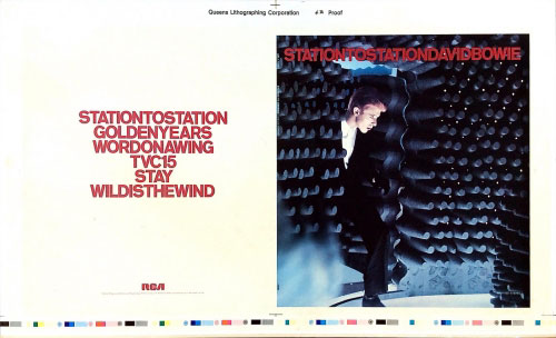
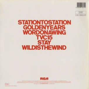
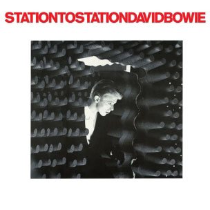
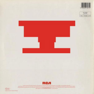
Why was the typography on the 'Station To Station' album sleeve created with no word spaces?
I've professionally worked in graphics and the print industry for over 40 years, and it might not seem a big deal now, but back in 1976 this lack of word spaced lettering was very, very peculiar and rather unsettling. I'd never seen anything like it before and nether had anyone else.
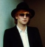
I'm sure you'll know the story that the full colour album sleeve was rejected by David. At the time he stated something about "the sky not looking real". I think what he really meant by that comment was that the red lettering over the sky didn't quite visually work. Hence we got red typeface with lots and lots of white space and a mono photograph.
I've been searching and searching ever since to no avail.
Then last month it hit me, like a ton of bricks. Right there, staring me in the face from across the room. I nearly fell off the settee!
Now I'm not going to start preaching Kabbalah, so I'll just let everyone make their own conclusions.
Look at the back cover of the Station To Station album. See the tracklisting? Blur your eyes slightly, and what do you see?
Hidden in plain sight is that a chalice? The Holy Grail? The Kabbalah Holy Cup of Life?
Obviously we know David was visualising a new beginning with this album, specifically so with his hymn 'Word On A Wing', which tells you really all you need to know.
Whether this Kabbala 'Cup of Life' or chalice was intentional or not, I guess we'll never know. Either way, it's pretty cool.
One thing I do know for sure is, if I would have discovered this a couple of years earlier and emailed to ask him if it was intended, he would have said one of two things:
'Yes. Well done. Give that man a cigar!'
or
'No. But it is now!'
Rednik.
23rd January 2018.